September 17, 2026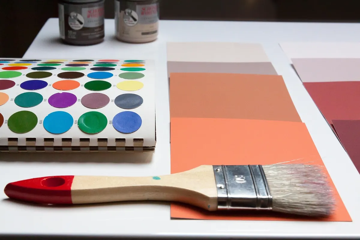
A north-facing room is the quiet one in the house. It never gets a stripe of sun across the floor, and on a grey afternoon the walls can look as though someone turned the saturation down. That does not make it a bad room. North light is even, soft and unusually consistent — much the same at nine in the morning as at four in the afternoon. It is also cool, carrying a bluish cast that quietly changes how every paint colour on your shortlist will behave. Choose with that cast in mind and a north room becomes calm instead of gloomy.
What North Light Actually Does to a Wall
Direct sun is warm and bright and slightly yellow. North light is none of those things. It arrives bounced off the sky, so it comes in cooler, softer and at a lower intensity, which means shadows are gentle and contrast is low. Colours in this light tend to look a shade cooler, a shade greyer and often a shade darker than they looked in the shop or on the sample chip.
What surrounds the window matters as much as the direction. A north window facing a leafy garden pushes a green cast into the room. One facing a grey road or a brick wall opposite pushes grey or dull red. A pale wall across the way can bounce a surprising amount of brightness back inside. Before you blame the paint, look at what the window is actually looking at.
Undertones Matter More Than Colour Names
Every paint colour has a base tone underneath the one you think you are buying. A "warm grey" might be built on yellow or on red; a "soft white" might sit on pink, cream, blue or plain grey. In north light, cool undertones get amplified and warm undertones get muffled. That is why a greige that felt cosy in a sunny south-facing sitting room can read like wet cement in a north-facing bedroom.
A useful habit: assume the room will make your chosen colour one notch cooler than the chip suggests, then choose one notch warmer to compensate. It also helps to check the paint's light reflectance value, usually listed as LRV on the label. It runs from zero (black) to 100 (pure white), and the higher the number, the more light the finish throws back into the room. In a room that receives no direct sun, that number does a lot of the heavy lifting.
Palettes That Brighten a North Room
You are not trying to fake sunshine. You are trying to add back the warmth that the light takes out, without turning the walls yellow or peach. These families tend to work well:
- Warm whites and creams. Ivory, off-white, chalk white with a yellow or pink base. This is the safest starting point and it keeps the room feeling open.
- Soft buttery yellows. Pale straw, warm sand, muted ochre. They mimic the warmth of sunlight without shouting.
- Blush, clay and dusty rose. Soft pinks and muted terracotta reflect warmth onto skin tones and timber, which is why they flatter north-facing bedrooms so well.
- Olive and warm sage. Greens with a yellow base rather than a blue one. They sit comfortably beside whatever is growing outside the window.
- Oatmeal, camel and mushroom. Neutrals built on red or yellow rather than grey. They read as calm rather than cold.
- Deeper accents for later in the day. Mustard, rust, warm navy or a soft charcoal used on a single wall or below a chair rail. These give the room somewhere to go once the lamps come on.
Cool Colours: Use Them on Purpose
Cool greys, blue-greys, arctic whites and lilacs are the shades most likely to disappoint here. In north light they lose their sparkle and can make a room feel chilly and slightly flat, especially in winter.
That does not mean they are banned. If you want a moody, contemplative study or a bedroom that feels like a cool retreat, a deep blue-grey or a muted slate can be beautiful — as long as you go in knowing the room will be dark and lean into it with warm lighting and warm textiles. The trouble starts when people expect a breezy coastal grey and get something closer to a car park.
How to Test a Colour Properly
Sample chips lie. They are small, they are printed rather than painted, and they are usually viewed under shop lighting. Here is a sequence that saves repainting:
- Buy sample pots rather than relying on the paper chip, and paint two coats onto a large sheet of primed white board, roughly 60cm square.
- Move the board around the room during the day — one wall that catches the most light, one dark corner, and one spot next to the floor and the trim.
- Look at it at three or four moments: early morning, mid-afternoon, early evening, and again at night with your own lamps switched on.
- Judge it beside the things that will stay in the room — the sofa, the rug, the timber floor, the curtains. Colours shift depending on their neighbours.
- Compare no more than two or three options at once. Beyond that, the eye loses the plot.
One last thing: paint looks lighter and slightly brighter while wet. Wait for it to dry fully before you decide, and remember that a whole wall of a colour will feel considerably stronger than a small board of it.
Small Adjustments That Add Warmth
Paint is only part of the picture. A few cheap moves make a measurable difference in a room that never sees the sun.
Lighting
Choose warm white bulbs in the 2700K to 3000K range rather than cool daylight bulbs, which will fight your warm paint and win. Use two or three smaller light sources — a floor lamp, a table lamp, a wall light — instead of one central ceiling fixture, so the room has pools of warmth rather than one cold wash.
Surfaces and finishes
Eggshell has a gentle sheen that bounces a little more light than flat matte, which is useful on north-facing walls. Keep the ceiling in a warm white or the same colour as the walls; a bright white ceiling can look grey and cold once the light drops. Paint trim in the same warm white family as the walls rather than a stark brilliant white, unless you specifically want crisp contrast.
Reflection
A mirror on the wall opposite the window doubles whatever light you do get, and a large mirror does more good than three small ones. Brass, bronze and warm-toned metals add a glow that chrome and brushed steel do not. Even a warm-toned rug will reflect a little soft colour upward onto pale walls.
A Simple Starting Point
If you want one dependable scheme, start with a warm off-white on the walls, a slightly deeper warm neutral or muted clay for a single alcove or chimney breast, and the same warm white on the trim and ceiling. Add warm bulbs, one good mirror and a textured rug, then live with it for a week before you judge.
If you are repainting several north-facing rooms, keep them within the same undertone family — all warm, all yellow-based, all red-based — so the house feels connected rather than patchy. And if the whole-house decision feels overwhelming, a colour consultant will usually save more in avoided repainting than their fee costs.
North-facing rooms reward a bit of patience. Get the undertone right and the even, unhurried light everyone else is chasing becomes the best thing about the room.
Photo: stux / Pixabay